While good report design is a skill that can take years to master, there are a few very, very basic concepts that will make your reports far better…and these concepts are pretty easy to learn.
My goal today is to walk through just those most basic concepts related to chart selection and page composition—also known as “the very basics.” This will by no means make you an expert, it will however get you over the first conceptual hurdles people tend to slam into after figuring out the basics of how to create a visual.
These aren’t really Power BI concepts, these are general visualization concepts. If you learn them they will work regardless of the tool. And precisely because these visualization concepts are tool-agnostic, they tend to be the things a lot of software tutorials don’t cover.
So enough talking about it, let’s get to work!
How Much Data Modeling Do You Need?
I’m going to assume that you already have a general sense of what your Power BI report is going to be about. I know that’s a big assumption, but I find that by the time people are asking me about designing a report, this is generally true.
You’ll hear lots of people talk about the importance of data modeling, myself very much among that chorus of voices. While it is important to appropriately model your data, a key word in this is “appropriately.”
Creating a report off of a single table built by you, by hand in Excel, can be absolutely fine for lots and lots of reports (particularly if you are not writing any complex DAX). There are drawbacks to this, but the obvious benefit of simplicity will often make this a very viable solution and you shouldn’t feel like you need to do tricky modeling to make a great report.
My only advice here is as follows: you can work off of a single big table, or you can build a fancy dimensional model with dedicated fact and dimension tables…but, pick one of those two options. Trying to do something in-between is where people get themselves into trouble.
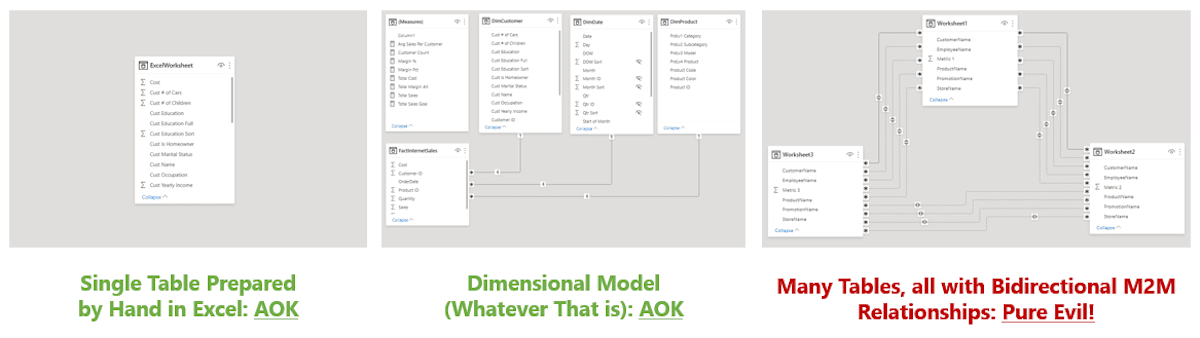
If the notion of loading multiple tables of data comes up, you either need to spend a good couple of days learning about dimensional models, or you need to merge those tables together before loading (lots of ways to do this, and good old VLOOKUP() can be your friend here.). The simple single table gets you a whole lot of value without losing lots of time to research.
So grab your single table or your fully dimensionalized mode, and let’s move onto the actual design phase.
Create a Brainstorm of Visuals
We’re going to start with something that isn’t even a first draft, this first bit is just you spending about 20-40 minutes quickly creating any visual you can think of just to see if it is interesting or not. And perhaps more importantly, to get a better sense of what is in the data.
- What calculations might be interesting?
- What might be interesting ways to break these calculations down?
- If you break down metrics by a particular category, do outliers show up?
- If you show metric B over time, do clear seasonal trends emerge?
Be encouraged to delete as you go. The purpose of this is to understand the data better more than anything else. Usually, none of what is produced here will end up in the final product.
When doing this exercise, it’s helpful to know what kind of visuals (chart types) you should be playing around with. As a hint, it is not all of them and it is probably not the most “exciting” visuals either.
If you are intimidated by Power BI’s large set of stock visuals, rejoice because I’m going to ask you to ignore most of them.
The Three Tier Classification for Visuals
Good data visualization is about clearly presenting data to decision-makers in a way that helps them make better decisions in less time. Designs should be simple, they should be clean, and they should draw attention to the data—never themselves.
Be very wary of designs that are “visually striking.” When data visualizations are visually striking, the effect is more often than not achieved by using a cacophony of meaningless geometry and high saturation colors to dazzle, but it does so at the cost of making the data understandable.
Over my career, I’ve seen countless reports that get enormous oohs and ahhs when they are revealed. These reports are never used because they were optimized for being colorful rather than being useful.
Other reports that are simple and straightforward might be derided as “plain” when released. But six months later, because they were designed to be useful, they actually get used. That’s your goal.
With that in mind, I generally suggest that most people try to use way too many different kinds of visuals (chart types). Often this is done to create “visual variety.” But as above, while “visual variety” can make a page more interesting to look at during an unveiling, it almost never makes a page more useful. If a report page isn’t working, this makes the problem worse, not better.
A useful mental model I use is this: Classify different visuals (chart types) into one of three tiers indicating their general appropriateness for report design. To simplify, when designing, you should be using:
- Tier One Visuals – constantly
- Tier Two Visuals – sometimes
- Tier Three Visuals – rarely
With that said, let’s look at these three tiers in greater detail.
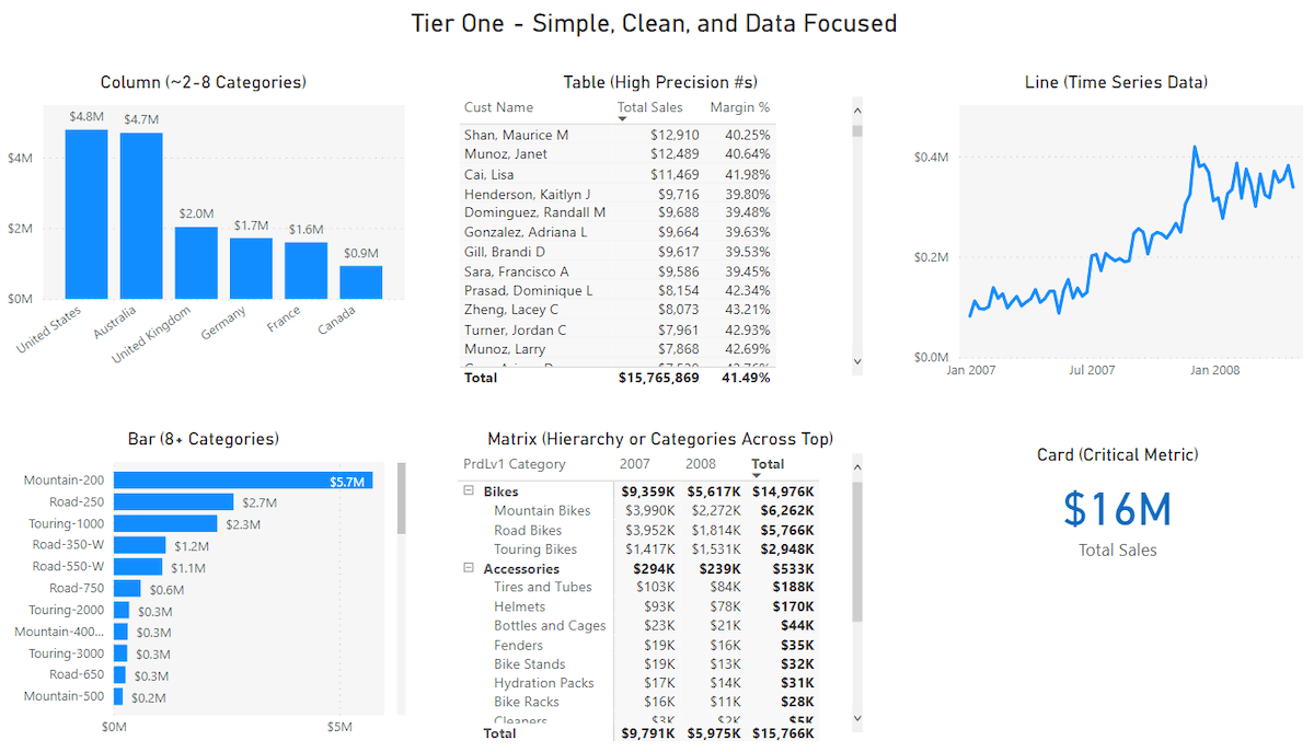
Tier One Visuals
Tier One visuals are the ones you should be using about 85% of the time. These visuals present data quickly and effectively in a way that doesn’t require additional training to understand. In a longer class, I would go through these, but there’s no need. You already know how to read them, which is a huge part of why they’re in the first tier.
Tier One visuals are the kinds of visuals you will find in a newspaper article (rather than a magazine advertisement) because they do their job. Most good report design falls around using these visuals effectively, rather than creating “visual variety” or “stunning graphics.”
While Tier One visuals should be your go-to visuals—and you can even create large numbers of reports never dipping into the other Tiers—there are other visuals that you can use, even if a little less often…like, Tier Two visuals.
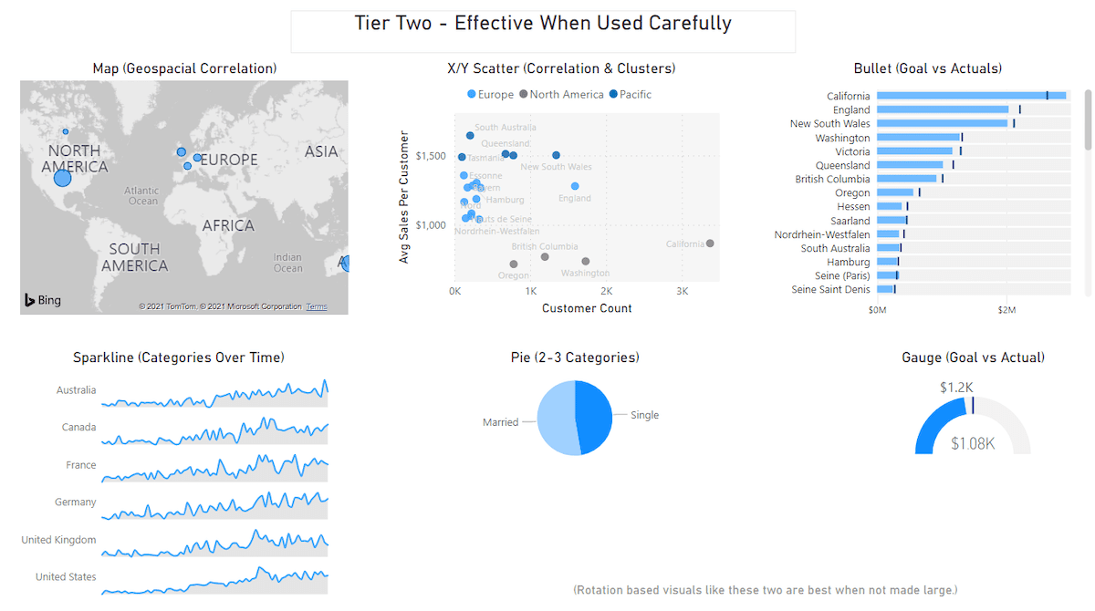
Tier Two Visuals
Tier Two visuals are what you should be using about 13% of the time. These are perfectly good visuals, but often get used when an equivalent Tier One visual could convey the same information with more accuracy in less time.
For example, maps often get used because they look cool. Unless you think some geospatial pattern will emerge, (i.e. sales is up for mid-sized cities all across the Mississippi River and nowhere else) for the most part, a column or bar chart will tell the story more simply—which should be the goal.
The map above isn’t bad, but a column chart with the same data would be much easier to read. And statistically people could compare the data points much faster, with fewer mistakes.
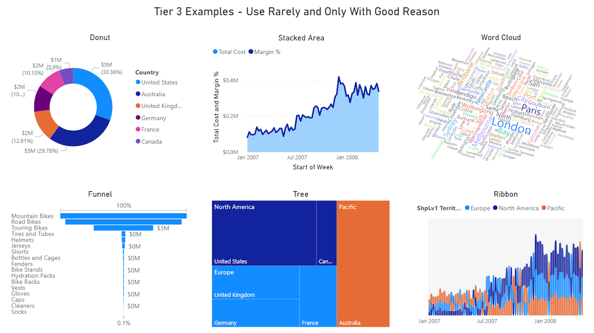
Tier Three Visuals
Tier Three visuals (aka, everything else) should be used the remaining 2% of the time. The image above contains a few examples, but there are tons of these ranging greatly in quality.
I can’t stress enough: There is nothing wrong inherently with Tier Three visuals, they are just very very overused.
In the right scenario they can be perfect, but rarely is that right scenario when they are used. Many Tier Three visuals trade readability for being “stunning” and they can almost always be replaced with a Tier One equivalent, allowing for the same information to be perceived by the human eye more accurately in less time.
Good visualizations (chart types) are like prime numbers. Yes, new ones will be discovered, but they are already rare and new visualizations will become increasingly rarer.
I don’t want to dissuade people from trying things out…experimentation is very valuable. But people do need to be sober-minded when finally settling on a visual.
That new advertised visual may be cool, but is it the simplest way of conveying the data to decision makers? If it is not, (which is most likely the case) it is your job to put the shiny visual away and replace it with the visual that does the job better.
Settle on Three To Five Key Charts
So after all that, it’s time to create our first round of actual visualizations we will use in the final report. This is simpler than it sounds.
On a fresh page create 3-5 visualizations that seem the most informative—the most useful metrics, broken down by the most interesting categories. You may create 10 or even 20, but before moving on, be ruthless and winnow it down to between 3 and 5.
Also, for what we’re doing, if cards are one of your visuals, you can count a handful of cards (say 3?) as one visual, since they are so compact. With this, you will probably have the report design that people usually bring to me. Something like…
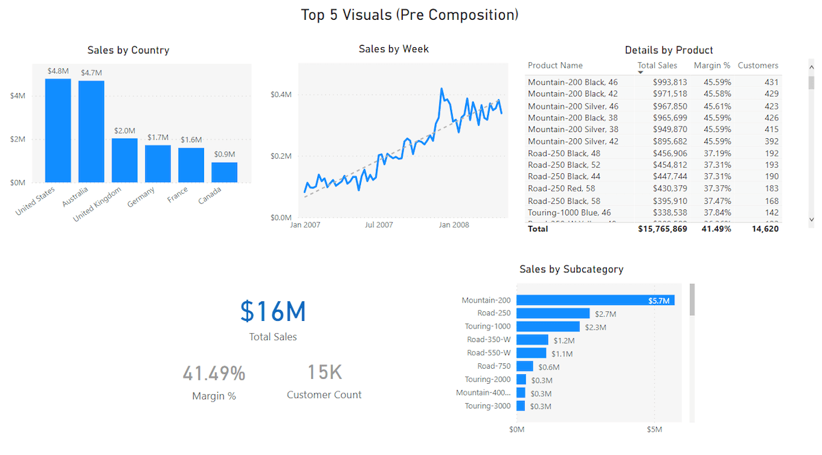
Something feels off and most people don’t know what it is. Here is where people take these perfectly good visuals and start converting them into Tier 3 visuals in the hopes that some sizzle will solve the problem.
I don’t mean to be too disparaging about this. I’ve been there myself, for sure. However, that sizzle isn’t what is causing this page to feel off. The issue is a lack of composition.
Composition: Eyes Go Where Now?
Most problems I see with reports stem from poor composition, which also tends to go hand in hand with a lack of focus. To speak more plainly, people will naturally come up with their list of visuals. Once done, they will lay them out in a simple grid-like formation (as we had above).
Visually the problem is that the report consumer’s eye does not know where to go when they open up the page. Since all visuals are given relatively equal visual weight and prominence, the eye will vaguely float to the top left visual as if the visuals were meant to be consumed like a book—left to right, top to bottom.
Another way to state this is: The human eye can’t easily figure out what this page is about because no one visual is clearly the focus of the page.
Just like in photography, with our report compositions it needs to be fairly clear to the audience what the most important visual on the page is because that conveys what the page is about and how it is supposed to be used.
And like in photography, I often refer to this as the subject visual (what the composition is about) with other visuals on the page being background visuals (providing context to the subject).
While you will often not figure this out until this stage of the process, before you can consider a report page ready for publishing, you must determine what the subject visual is (the most important visual on the page). You must also give it visual prominence so the end-user knows where to look when they open the page.
The good news is that other than determining which visual is most important, which sometimes involves trial and error, giving it visual prominence is easy.
Bigger and In the Right Spot
The subject visual is usually both the biggest visual and on one of the major one-third lines of the page. The major one-third lines are one-third from the top of the page and one-third from the left edge of the page. These best practices relate to the “Rule of Thirds” in photography and “Eyeline” in cinematography.
Writing this out makes it sound more complicated than it is. To give the most important visual on the page prominence, make it bigger and place it along one of the two glowing lines below.
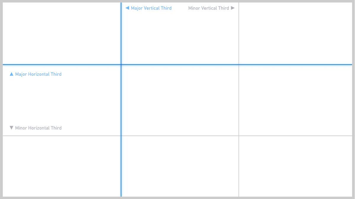
Most of the time you will place the subject visual along the top one-third line. This is the most natural and works for visuals that require more left-to-right space (which is most of them).
Before we walk through all four examples, why don’t I show them to you all at once so you see how each is just a variation on “pick a main visual and put it either on the top or left one-third line.”
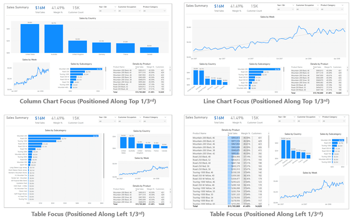
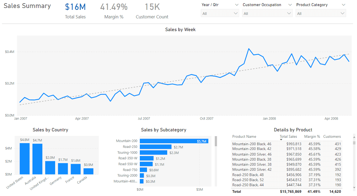
So, say for example that we decide “Sales by Country” should be our subject visual—the visual the page is about and hence where the user’s eye should first go. We could easily rearrange our existing visuals to make “Sales by Country” larger and place it along the top one-third line.
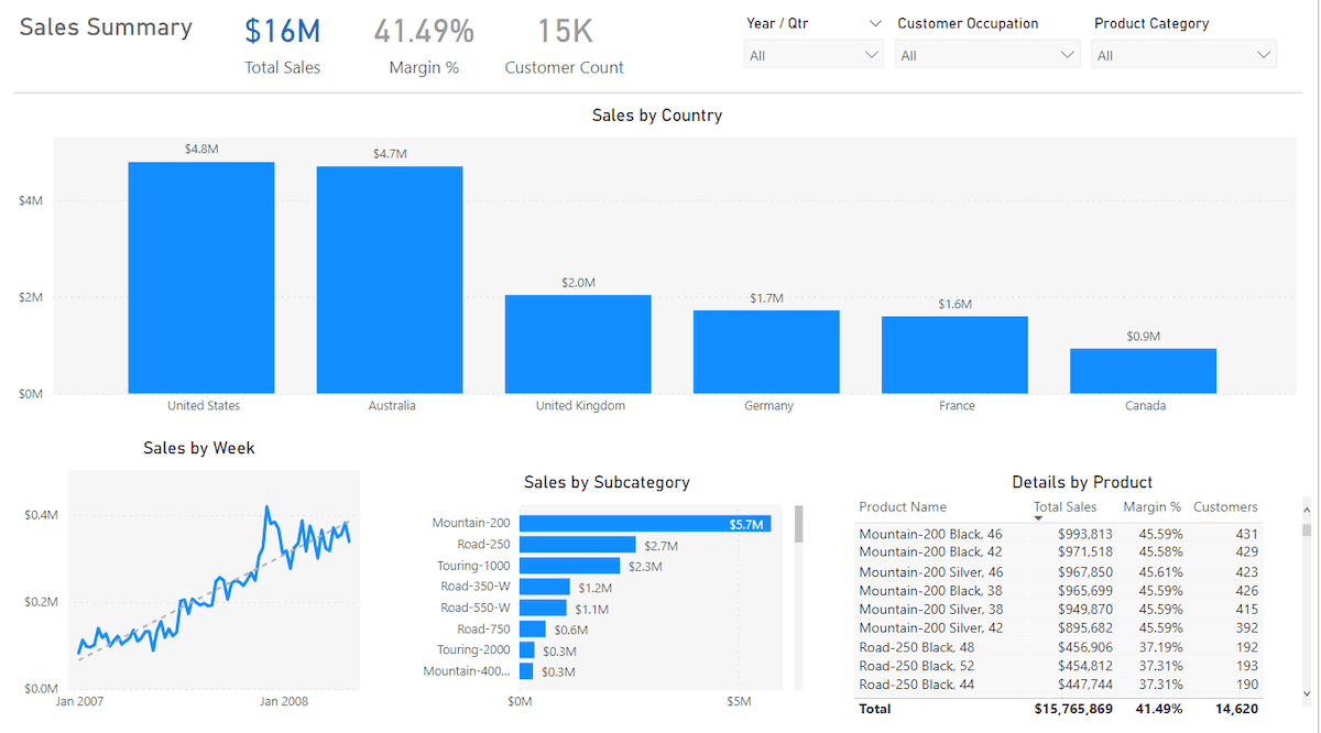
Just like that, when we open up the page, our eyes know to jump to the large and prominently placed column chart. And hence, we as users know what the page is about. Other visuals on the page are important, but they clearly are in service of that subject visual.
In addition to the subject and background elements, notice I’ve added what could be called an “Administrative Strip” up top containing things like the report name, slicers, and a few cards.
This mimics most applications people use in other places and makes for an easy-to-learn experience. To create separation between this area and the rest of the report is a simple light gray line. More complicated versions of this exist, but this visual is easy and works quite well.
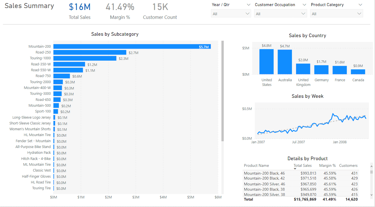
If instead, we decide that the line chart is the most important visual on the page (the subject visual), a bit of simple resizing gets us a different but equally understandable page.
Walking Tall
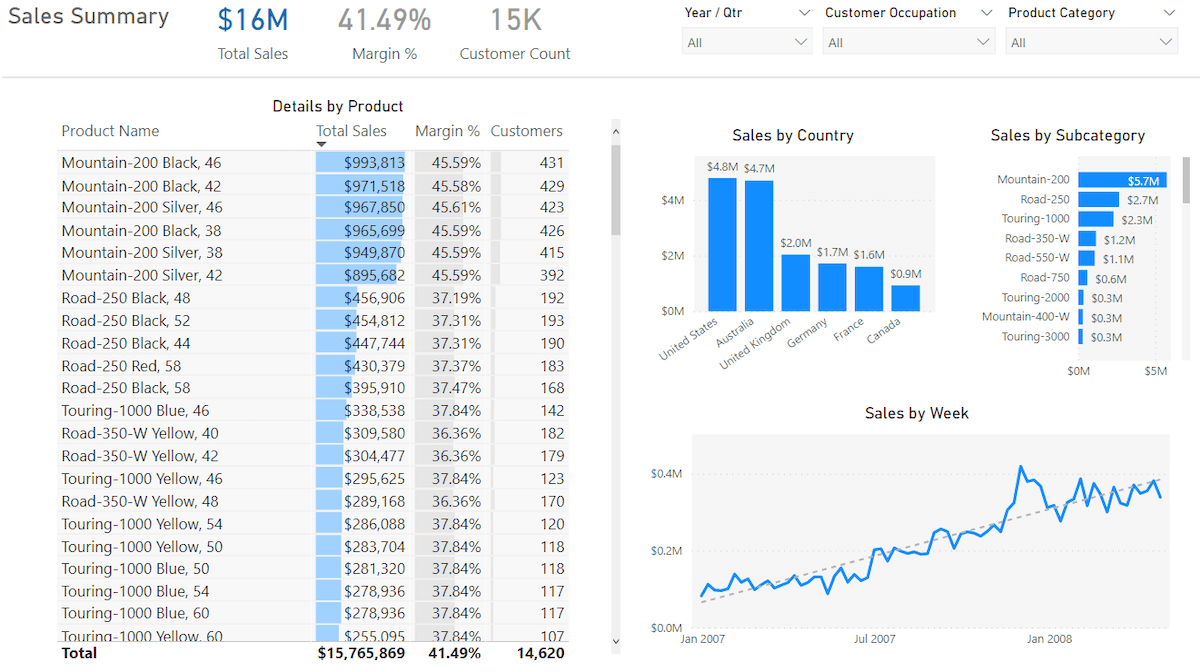
Sometimes your subject visual benefits more from having a lot of top-to-bottom space, rather than left-to-right space. In this case, placement along the left one-third is more appropriate. For example, if we decide the subject visual is instead the bar chart, we can again rearrange and get a different but equally as easy to understand page.
While this bar chart could technically work along the top one-third line, having the bars be slightly wider would actually make them harder to compare—rather than easier. Perhaps more importantly, making the visual taller allows us to see a larger number of bars, which is quite useful and a good reason to go with the left one-third choice.
Table and Matrix visuals can work well along either one-third line, depending on the number of columns involved.
With a large number of columns, it is ideal for users to see as many columns as possible without scrolling. So a top one-third orientation using a wide visual is best. However, in our example, the table only has a few columns and lots of rows. So the tall visual along the left one-third makes the most sense.
Here I’ve also increased the font of the table and added some conditional formatting, but this is icing on the cake. The larger size and placement alone are the most important things here and they work quite well.
Notice in all four scenarios the other background visuals are distributed fairly evenly in the remaining space. And yet it is incredibly clear what a user should look at when they open the page. This makes for a report that is easy-to-use and effective at conveying data.
Is That All You Really Need?
While one could talk for hours about the different methods for designing a Power BI report, you can get an incredible amount of mileage with just the basics concepts we’ve talked about here.
Create a small number of Tier One or Tier Two visuals, pick the most important one, make it bigger and place it along a major third of the page. Most of the bad report designs I encounter out in the world could be solved if they just adhere to these simple rules.
If you can do that, you’re well on your way to producing some effective Power BI reports.